Sample Development | Market Signs

I really wanted to incorporate print somehow into my marketplace development, and after looking at all of the photos I'd collected, I noticed I'd taken a lot of the different signage used by the stalls to sell their goods.
One particular cheese stall was full of bright signs with interesting typography and I felt this would be perfect for a print as the letters were bold and would stand out against my fabric.
I first drew out my stencil by hand onto a bit of card and cut it out. I think creating my own stencil was another great way of really personalising my work, rather than by getting a stencil or a typeface from the internet.
I cut out my stencil and decided to use procion dyes on a silk screen to dye my fabric and make my sample. I placed my fabric down and arranged my letters on top where I wanted them to go, put the screen on top of this and dragged the dye through using a squeegee. I decided to use red as it's the most eye catching colour when it comes to selling (sale signs in shops for example) and I think it looks really stark and does indeed stand out.


To further work into my sample, I used a contrasting yellow thread to hand-embroider around the outline of the words and numbers. Hand embroidery is one of my favourite skills and something I've practised for years so it was nice to add an extra element into my work and I'm really pleased with the finished result as it breaks up the textures a bit and really makes the sample pop.
To finish it off, I decided to do a bit of couching, having not experimented with the particular technique since our first embroidery workshop. While on a frantic stationery haul in the student shop, I noticed some pipe cleaners on sale and thought it would be fun to experiment couching down with them.
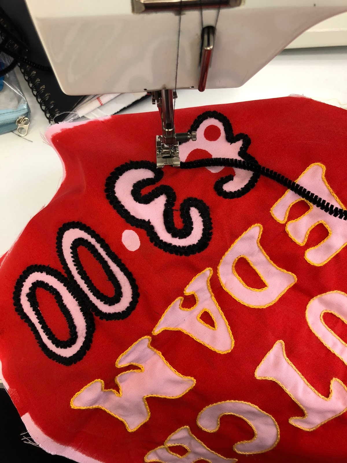

Little did I know that they would be so easy to couch down due to the wire inside and it was so easy to bend around all of the curves of the letters. I'd perhaps have liked to use a different colour pipe cleaner on this particular as I think the black looks quite harsh but nonetheless I'm happy with the outcome.
While I'm still not entirely sure what I want my final outcome to be, I've decided I'd really like to create more prints mimicing the signage of the markets and embellish each one in different ways, in different colours as an homage to the different stalls.


Comments
Post a Comment